Background to the first public transportation network in Europe and how post coaches fair, compared to trains.
I wanted to show a comparison of different periods and their transportation systems in isochrone maps. I am not the first to come up with this idea, in 1903, Wilhelm Schjerning completed a study of isochrone maps for the Prussian province Brandenburg. They show the travel times for 1819, 1851, 1875, 1899 and a 5 hour version for 1903. Schjerning published them in the Zeitschrift der Gesellschaft für Erdkunde zu Berlin / Zeitschriftenband (1903)
The first map I saw from Schjerning was in an article by Martin Grötschel and Ralf Borndörfer of the Zuse-Institute.

It shows the province Brandenburg and isochrones for every one hour travel time starting from Berlin, reaching the furthest point in about 34 hours. Wilhelm Schjerning also published isochrone maps for Aachen for 1897, Northern Surroundings of Berlin for 1902 and Herzogtum Salzburg for 1899, all drawn around 1903.
Working off Schjerning map I created this isochrone map from Berlin in the year 1819.
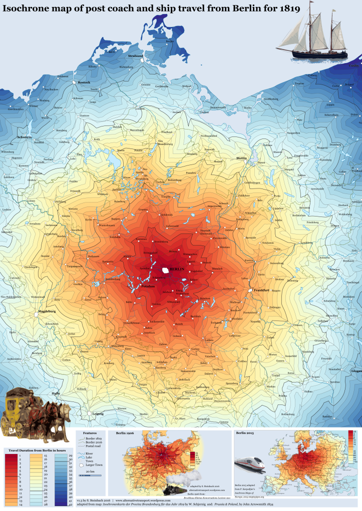
Starting from Berlin it shows the post coach roads in all directions. Isochrones are placed at every hour with a thicker line at 6 hour interval. The speed of a post coach is 6 to 8 km/h, other paths and over fields 3 to 4 km/h. Faintly in a dash dot line the provincial and country borders are shown in dark green and in a dotted line the current border of the federal state Brandenburg and Berlin. Lakes, rivers and towns are shown, and postal roads outside of Brandenburg according to 1834 Prussia & Poland, by the John Arrowsmith available by the David Rumsey Map Collection. Travelling by post coach was about twice as fast as walking on paths or over fields, but there were no extreme well connected routes, that caused pronounced spikes in any direction. Potsdam could be reached in 4 hours, Frankfurt 12, Stettin and Magdeburg in 20 hours, Leipzig 23, Halle 24, Strahlsund and Rostock 31, Colberg 37 and Coslin 41 hours. Reaching the north point of Rügen took 42 hours.
For comparison, at the bottom there are two isochrone maps starting from Berlin for 1906 and 2015.
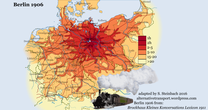
The 1906 version is based on a map from the Brockhaus Lexicon 1911 and what a difference 87 years makes. Instead of a relatively even isochrone lines, numerous pronounced routes can be traced out of the dense German railway network. Stettin (formerly 20 hours) could be reached in 2 hours, Halle(24), Leipzig(23), Stralsund(31), Rostock(31) and Hamburg in 2 to 5 hours. Kolberg (37) and Coslin (41), München, Danzig, Ostrau, Prag, Köln and Königsberg in 5 to 10 hours. Basel, Amsterdam, Malmö, Kopenhagen and Vienna could be reached within 15 to 20 hours and Zürich, Luxemburg and Nancy more than 20 hours.
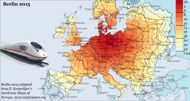
The second comparison map is based on work by Peter Kerpedjiev. It shows in 2 hour isochrones the time it takes to reach parts of Europe from Berlin. The more pronounced routes are smoothed by an increased speed for all still existing rail lines and due to the large amount of data Peter processed to calculate the maps. Leipzig (formerly 24 hours and about 3 to 4 hours) can be reached in 2 hours. For the time it took to reach Leipzig from Berlin in 1819, you can be in Moskva or Madrid by train.
References:
- The colour categories are based on a set by colorbrewer2.org and re-brewed to fit 42 categories.
- Some roads assumed based on Prussia & Poland.
- The post coach in the lower left is adapted from a painting of that era found at the Massovia blog, which also describes the trade routes and travel around of this region.
- The postal ship shown in the upper right corner is adapted from the Fulvia, commissioned in 1898.
- The 1906 isochrone map is based on one published in the Brockhaus Kleines Konversations-Lexikon Fünfte Auflage von 1911 found here.
- The 2015 Isochrone map is by Peter Kerpedjiev at emptypipes.org.
Edit 21.12.2016:
Changed thicker lines intervals from every 5 hours to every 6 hours.
Edit 16.01.2017:
Corrected legend and recoulored Hiddensee.

Animated Isochrone Maps that show the changes in travelling times over each hour of the day are dubbed as heartbeat Isochrone Maps. You can see why from this example below from Esri UK, which shows a pattern of the blue area beating in and out.
LikeLike
The comparison with the older maps as to the actual perception of space and travel time is a bit weak if air traffic isn’t included.
LikeLike
True, air travel would also have been interesting. Maybe check out Adrian‘s South Africa map
LikeLike
[…] this somewhat different isochrone map. Instead of to or from one point (see London, Vienna and Berlin isochrone maps) or even to several points (see Wales), the Drive time to the centerline of the […]
LikeLike
Beautiful infographic, both aestethically and content-wise.
One small point I would like to make: I think thickening the lines at 6-hour intervals, with an additional thickenning at 24h would have been more natural. I think 12h (half a day), 24h (a day) and 36h (a day and a half) are closer to how people perceive long distance travel than a strictly decimal breakdown.
LikeLike
Thank you! Makes sense,I think I originally went with 5 hour intervals, because it matched up with the Brockhaus map. I will change it to 6 hour intervals.
LikeLike
Speaking of which, you skipped the “10-15” interval on your legend (thus your last coulour should be “15-20” or “>15” instead of “>20”).
LikeLike