I came across a wonderful infographic via Cool Infographics

It is by Alberto Lucas López and published in the South China Morning Post.
It shows the 23 largest languages grouped together in one bubble that represents 4.1 billion people who have those languages as their native language.
It is similar to John Pasden’s 2009 infographic
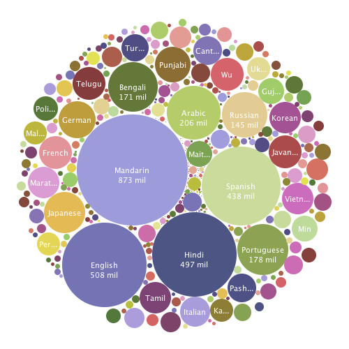
López had a different approach than Pasden and instead of having many bubbles, one for each language, he made one and sliced that one up into pie pieces. He also used colours to show where what language is spoken by adding a locater map and added some useful information.
Data is off
Looking at López infographic, I think something cannot be right here, the data is off. For example, why is there only 78.1 million native German speakers? Only 69.8 million people in Germany have German as their native language? Germany’s population is 81.08 million, where are the missing 11.28 million Germans that speak a different language? Well, to figure that out you should look through the source from Alberto Lucas López, which, among others, is Ethnologue: Languages of the World, Eighteenth edition. Here the entry for Germany. It states 80.652 million as the population of Germany and then it goes on to list 43 immigrant languages, 29 of those also have numbers in brackets next to them. Beginning with Laz (1000) and ending with Turkish (2.11 million speakers) and if you add up all of those native speakers then you get 5.59 million. So if you subtract 5.59 million from 80.65 million you get 75.06 million. There is still another 5.26 million missing to the 69.8 million on the diagram. Where are those?
Come to think of it, looking at German, I see Germany, Poland and Switzerland where is Austria?

Switzerland only has 700 000 German native speakers (should be about 5.38 million)? Quick check by French, there it says 1.9 million Swiss native French speakers, that is correct. 700 000 Swiss native Italian speakers is also correct.
Okay so, by German there was error by how many Swiss speak German, then Austria is completely missing and we do not know what 5.26 million Germans speak. It might be a bit steep to assume that all of those 43 immigrant languages’ retain their language as native and but many do. It could be fair to assume that the 2.11 million speakers of the 2nd largest Turkish nation (Germany) should be added to Turkish in the diagram. Quick check by Turkish: no, those Turkish Germans that were subtracted from Germany were not added to Turkish.

After digging deeper I found this page called Standard German and it shows you what really happened here. According to it, only people in the Austrian federal state Vorarlberg speak German, and the rest of those Austrians speak Bavarian.
I don’t believe that Alberto Lucas López wilfully compromised the data, it is that Ethnologue.com has strange way of grouping languages. You see, to calculate how many Chinese native speakers there are the following languages are added together, Gan, Hakka, Huizhou, Jinyu, Mandarin, Min Bei, Min Dong, Min Nan, Min Zhong, Pu-Xian, Wu, Xiang, Cantonese and Yue. Mandarin, on its own has about 848 million native speakers.
To calculate how many German native speakers there are, only Standard German is taken, not Suabian, Schwyzerdütsch, Franconian, Westfaelien, Low German, Middle German or Bavarian (with 14.09 Million speakers), just High (standard) German.
Language Families and Branches
If you group Jin together with Cantonese and everything in between, then you might as well group Romanian together with Portuguese and every Romance language in between as well. Back, when I first looked at Pasden’s 2009 infographic (the one with the many bubbles) I thought it was a shame that the languages were not grouped a little to show their relationship, but Pasden influenced my version of lexical distances and I calculated each bubble separately there. One way to solve the López’s distortions by groupings of Chinese languages (and Arabic for that matter) would be to position the pie pieces similar to a lexical distance diagram with thicker lines between language families, then a little less thicker between branches, then between individual languages and finally between countries.
More Information on the graphic
López also added some useful information to the graphic, distribution of living languages by country, number of countries in which a language is spoken and most popular languages being learned, all of those numbers mainly are from Ethnologue.com. Then he added a world map in the upper right corner and colour coded it for North America, South America, Africa, Europe West, Europe East, Asia Major, Asia Minor, Middle East and Oceania. I do not really agree with the grouping, e.g. Germany is East Europe but Serbia is in West Europe? Asia Major has lots of land but Asia Minor has almost the same amount of land (map projection beware) and lots of people? Alright, well on top of that a couple of mistakes snuck in anyway, Bangladesh is part of the Middle East even though India is part of Asia Minor, Mexico is in South America even though Honduras, El Salvador, Nicaragua, Panama, Guantemala and Costa Rica are in North America?
Pie Pieces have incorrect sizes
According to the infographic numbers there are 4.6 times as many Chinese speakers as there are Hindi speakers, the chart area gives Chinese 5 times the area as Hindi. Okay, so a 9% extravagation of Chinese. On the other hand, English enjoys a 5% too big area compared to Chinese. It is not that much off but it could be better.
I still really like the layout, concept, colour selection and idea! I don’t blame López for the data inaccuracy or the way the languages were grouped. One could suspect that the data is biased towards Chinese but as far as I can tell, Ethnologue.com is based in Texas, USA, I assume it is not. I would not even be too harsh to Ethnologue.com for mixing up the German groups, they have a lot of interesting information which of course takes time and resources to maintain. But I think a Languages of the World infographic could be improved.
Edit 2017.02.27:
The Humans Who Read Grammars blog also dissected this infographic and raised some issues not discussed here. Another post on this blog merely compares the Levenshtein Distance of a small list of words in different languages to calculate a lexical distance diagram. If that is a too simple approach to comparative linguistics for you; I strongly recommend visiting that blog, maintained by a group of young linguists, the humans-who-read-grammars.blogspot.com.

Great site. But I don’t like the fact that the design of this 23 languages infographic hides the importance of the more than 7000 other languages. Its circular format creates a false impression about the distribution of mother tongues. It looks like those 23 big languages are all there is, since they occupy 100% of the world-pie. But this illustration only covers 4.1 billion of the 7.2 billion people on Earth. In the real world-pie of mother tongues, these 23 large languages would only occupy a little over half the pie (57%). The other 43% is, for me, the mind blowing part: 3.1 billion people whose mother tongue is a relatively small language – one of the 7000 or so we have. What visibility do those languages have? Not much.
LikeLike
[…] La seconde vient de là. […]
LikeLike
I stumbled on ur site tx to Reddit…originaly i deemed the map to be interesting, but i cant unnotice, that
the “artist” obviously assumes there is no african language being spoken by at least 50m as their first one.
so much for precision….
LikeLike
[…] 23 Languages of the World […]
LikeLike
These are beautiful infographics! Every time I visit your blog I find something new to marvel at. Love your explanations too.
LikeLike